Field notes / Film production
From a generated image to a Blender film
A practical production guide, told through the mistakes in our 22-second aictrl film.
The first full 3D scene had the agents, the workstations and the three floors. It also looked like a set of shelves.
That was a useful failure. We had reproduced the inventory of our reference image and lost its architecture. Later, we made a different version of the same mistake: the transition into a workflow looked cleaner, but the agents had stopped doing their jobs.
We built a short homepage film for aictrl from generated concept images, an authored Blender scene, and a transition into a flat, product-derived workflow. This guide explains how those pieces fit together, what Blender actually controlled, and which reviews we would bring forward next time. It is for product teams and developers planning a small animated film, rather than a complete Blender modelling tutorial.
The production route below is the one we would use next time. Disney Animation distinguishes development, asset creation, shot production and finishing; editorial begins during development. Blender Studio describes previs/layout as the bridge between a storyboard animatic and full animation. We have adapted those practices to a small, silent product film. This is a recommended route, not a claim that we completed every stage in this order. Disney Animation: filmmaking process; Blender Studio: layout and previs.
A production route for a small product film
Prove the story before polishing the frames.
- 01Plan the story
Evidence: a rough cut whose story is understandable.
- 02Develop the worldStyle frame + look testsShape, colour and lighting3D layout + models + rigsCamera, space and contact
Evidence: matching camera views and one working interaction.
- 03Build the performance
Evidence: readable action in the intended camera.
- 04Finish in context
Evidence: a served cut that an unfamiliar viewer can follow.
Each checkpoint asks for evidence before the next expensive commitment. The work still overlaps: a difficult rig can change a shot, and a rough edit can send us back to the storyboard. Here is the current cut, followed by the decisions behind it.
1. Give the scene a job before giving it a camera
We wanted to show several agents working independently while sharing a common source of skills. A task should move through Build and Review. If review found a problem, it should return to Build without stopping the other work. The result should leave room for a human decision.
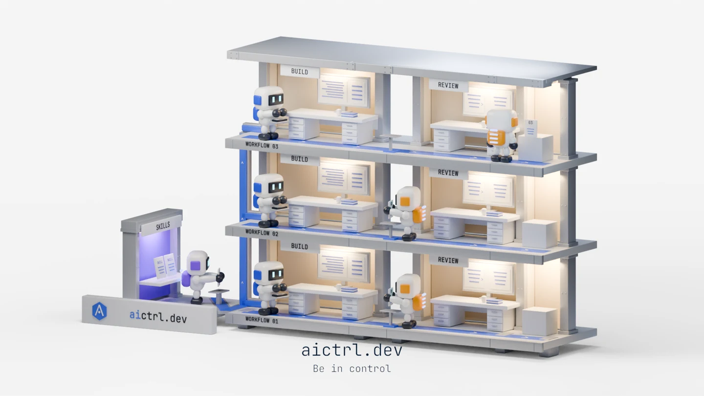
Those relationships became the scene: three parallel floors, a builder and reviewer on each floor, and a shared source booth. Blue identified Build; amber identified Review and its return path. The task itself needed to stay recognisable as it passed between agents.
A useful brief, reconstructed from the production plan, is:
Show independent build–review workflows using shared skills. Follow a piece of work through a local revision. Finish by connecting that activity to a workflow a person can inspect and approve.
The useful output is a set of story beats: the small changes the viewer must understand, such as “review finds a problem” and “work returns to the builder”.
The original shot plan included source pickup, parallel work, a review return and an output handoff. We started with some work already underway. The film’s clock was there to explain a process, not to suggest that real software changes finish in a few seconds.
The same discipline later prevented a tempting mistake. Three floors could have flattened into three attractive boxes. But that would turn three independent workflows into three consecutive steps. We needed to isolate one floor’s Build–Review loop before entering the product view.
2. Use a style frame—and know what it cannot prove
Our first generated concept was a miniature architectural world: an instructions kiosk, separate Build and Create workspaces, and Review on an upper level. Bridges, stairs, plants and work-carrying agents made it feel occupied.
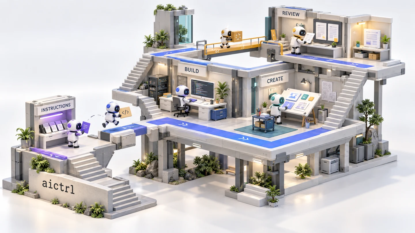
The later reference reorganised that world into three repeated Build–Review lanes. Comparing them shows a design trade-off: the first concept has more architectural variety; the later one makes repetition and parallel work more explicit. We chose the latter as the reconstruction target, while still needing to preserve the depth and sense of occupation that made the first concept engaging.
This is the job of a style frame: a target for architecture, characters, lighting and colour. A storyboard has a different job: several drawings explain what changes from beat to beat. An animatic puts those drawings on a timeline so we can test the order and duration before detailed animation.
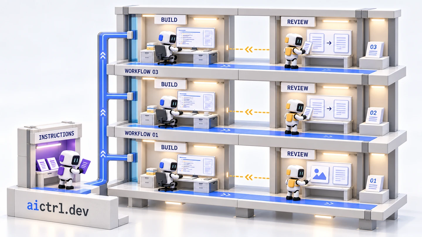
This still did more than suggest a style. Its occupied rooms made the agents feel part of a workplace. The central openings separated Build from Review. The shared booth belonged to the same world while facing a different direction. The large aictrl.dev bar anchored the whole structure.
The feedback became increasingly concrete. The colours needed the energy of the selected reference. “INSTRUCTIONS” should become “SKILLS” or “SKILLS.md”. The brand bar needed enough room for the hexagonal logo. And the booth was not merely “at an angle”: it needed the original perpendicular relationship, facing the other direction from an attempted revision.
That last correction was easy to underestimate. A slight turn can look polished in isolation and still change the composition. We eventually made the relationship explicit in the model: the booth and main facade face directions 90 degrees apart, while the brand bar stays aligned with the main building.
The generated still even repeated a workflow number; matching it faithfully did not mean preserving every incidental error. More importantly, no still could prove that the camera turn and workflow reveal would be readable. We had a shot plan and later timing studies, but the homepage transition arrived after the factory film. Next time, we would put the factory, the alignment pose and the final workflow into one rough edit before polishing any of them.
3. Use Blender to build a world you can control
Blender held the editable 3D scene: shapes, materials, lights, cameras and animation. Python scripts using Blender’s bpy API created and changed that scene. SVG supplied the flat workflow artwork; FFmpeg assembled frames and encoded the cut. We did not use the reference image as a mesh, or ask an image-to-video model to invent the finished movement.
That split mattered. A request such as “turn the booth exactly 90 degrees” became a change to an object’s rotation. “Keep walking while the camera turns” required animation data to survive a scene rebuild. Both were decisions we could inspect and reproduce.
Build one bay before building three floors
Our building and bots were assembled from relatively simple geometry. The character script made rounded boxes from cubes with bevelled edges, and used spheres and elongated forms for hands and limbs. Named materials controlled the white shell, dark visor and role colours. Invisible controller objects grouped pieces so we could move the character without repositioning every mesh separately.
For a similar scene, start with a blockout: plain boxes for the room, desk and agent, viewed through the intended camera. Compare the framing, empty spaces and relative sizes against the reference before adding signs, keys or surface detail. Our early full-scene reconstruction demonstrates why: the objects were present, but the rooms were not.
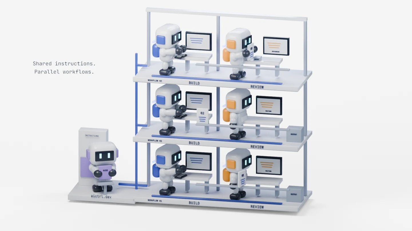
The response was to stop and rebuild the architecture before spending more time on a full render. We restored paired bays, cabinets, central openings and deeper framing. Reducing the agents’ scale relative to those spaces helped the building read as a workplace again.
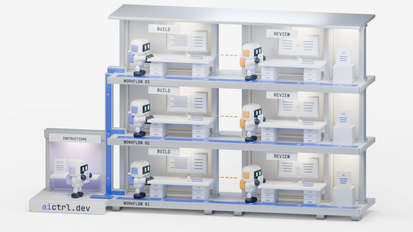
A useful blockout review compares three things separately: camera framing, building proportions and agent scale. Changing the camera to compensate for a shallow room can hide the problem in one view and reveal it during the turn. Check the wide opening and the future front-facing transition view before duplicating a bay.
Our camera used orthographic projection: parallel lines stay parallel, and changing the camera’s orthographic scale changes how much of the world fits in the image. It suited the architectural illustration and later flat layout. In a perspective scene, depth also changes apparent size, so matching a monitor to a card would need to account for that. Blender Manual: cameras.
The review question became “Do these agents fit inside deep rooms with an opening between Build and Review?” That is much more useful than counting three floors and six monitors.
Make the rig serve the action
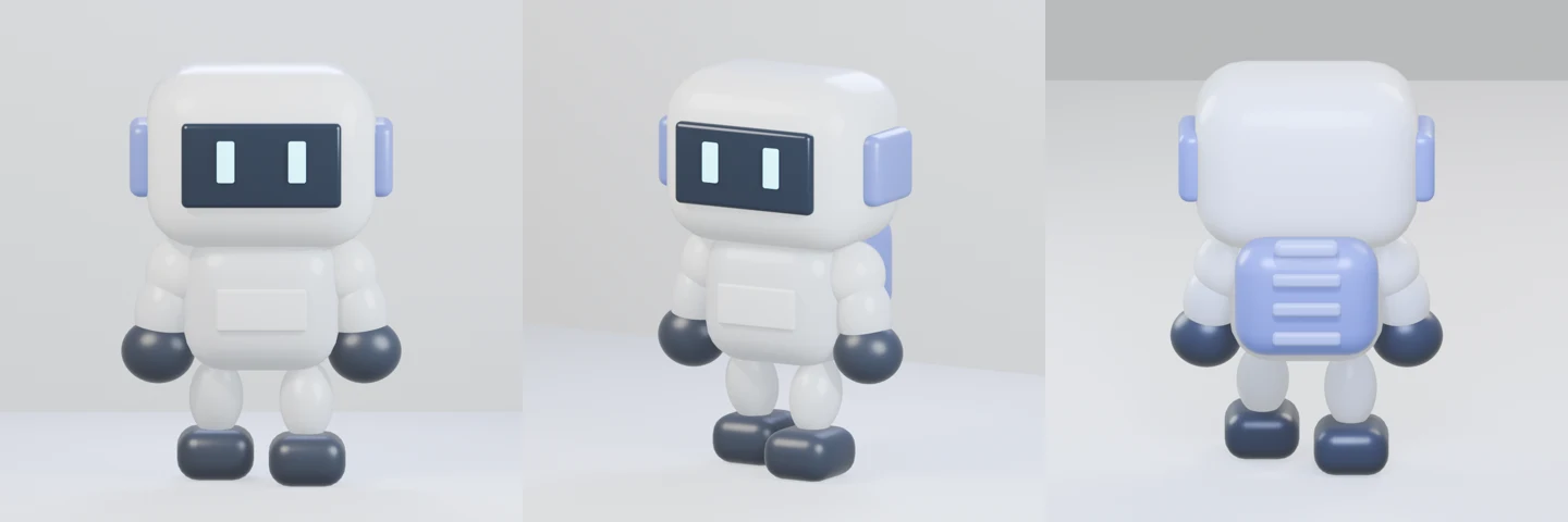
A rig is the set of controls used to pose and move a character. Our compact bot used a hierarchy of controller objects and separate mesh parts, with procedural limb positioning. It was not a full facial or body-deformation rig. Characters needed their own smaller proof. Early limb and proportion studies gave way to a compact figure: a large porcelain head, dark visor, cyan eyes, short solid limbs and dark boots. The replacement was approximately two and a half heads tall. It had to work from several angles and remain readable at the size of an agent in the full scene.
Three Blender concepts explain most of the motion repairs:
- Parenting: a child object follows its parent. In the carry study, the card followed the mitten, so hand and card did not need competing motion paths. The reverse applies to a planted foot: it must stay still relative to the floor while the body advances. During the planted part of a step, our walk compensated for root movement in the foot’s local coordinates; during the swing, the foot was free to advance.
- Keyframes: these store property values at particular frames. Interpolation controls the values between them. Two correct endpoint poses can still produce a bad reach in between; inspect the path, not just the endpoints. Blender exposes those timing curves in its Graph Editor. Blender Manual: keyframes and interpolation.
- Contact: define what is touching what, and when. We checked the keycap tops for typing, the mitten for carrying, and the floor for stance. The keyboard base was the wrong surface to use for hand contact.
In simplified transform notation, a carried prop uses task_world = hand_world × grip_offset. A planted foot uses foot_local = inverse(root_world) × floor_contact_world. These describe the relationships, not a drop-in rig implementation. One follows a moving anchor; the other compensates for it.
For your first motion proof, keep the camera fixed and animate only pickup → carry → dock. Scrub the frames just before and after each change. Check from the render camera for readability, then from the side for penetration or gaps. Only combine the action with a moving camera after that exchange works.
The rebuilt architecture needed another motion pass because furniture depth and turning clearance had changed. A reviewer facing the wrong way made the card cross its body on the way to its grip. A short receiving proof isolated that problem more effectively than another full-film export.
Separate look development from rendering
Look development decides how materials and lighting make the scene read. Rendering turns the scene at a particular time into an image. We tested lighting and architectural finishes, used EEVEE for the initial character setup and Cycles for the final factory frames. Increasing render samples would not have repaired the shelf-like composition; that required geometry and scale changes.
For a small production, compare representative stills in the opening, transition and ending before rendering the whole cut. Check whether the subject separates from its background and whether the role colours survive the change of medium. Keep those frames together as a visual target for subsequent exports.
We rendered frame sequences before encoding the film. That keeps a render separate from the edit and allows selected frames to be replaced. Blender’s manual recommends the frame-sequence approach for longer renders and post-production work. Our compositor used SVG and our encoder used FFmpeg; Blender’s own Compositor and Video Sequencer are other documented parts of that route. Blender Manual: rendering animations.
4. Start the transition before the dissolve
Once the factory worked, we needed to connect it to what aictrl actually organises: workflow steps and the agents attached to them.
Our first direction was a blueprint-like flat workflow. It retained the blue Build and amber Review identities, with a return path for revision. The layout took its cues from Workflow Studio, but the flattened characters and blueprint treatment were a proposed visual layer, not a screenshot of a shipped screen.
The difficult part was getting there. Starting a dissolve from the wide factory view meant changing camera angle, scale, architecture, character position and drawing style together. Too much had to become something else at once.
The fix was to do more preparation while the scene was still 3D:
- Rotate toward the workflow’s viewing angle.
- Remove the other floors so one independent lane remains.
- Adjust scale and move the selected agents into their flat positions.
- Simplify the workstations until the monitor housings can become workflow cards.
- Only then blend into the flat drawing.
The choice of matching object helped. Mapping a whole workstation to a workflow box forced the desk, stand and monitor into one shape. Mapping the monitor housing to the card let us remove the furniture earlier, while it still belonged to the 3D world.
We treated the characters the same way. Their hands lowered before flattening. The flat agents lost their backpacks. Head and face proportions were matched to the projected 3D characters, reducing the amount of visible reshaping at the join.
Match in the image plane
The practical bridge was screen-space alignment. First define the flat card’s rectangle. Then project the 3D monitor through the final camera and compare its visible bounds to that rectangle. Adjust position and scale until they agree. Do this after the final pose is evaluated: lowering a hand changes the character’s outline.
Our alignment script used Blender’s world_to_camera_view to project mesh vertices and measured the resulting bounds. On the 1600-pixel-wide design canvas, the final orthographic view spanned 22 scene units. A 264-pixel-wide card therefore occupied 264 × 22 / 1600 = 3.63 scene units horizontally. That gave us a target monitor width, rather than a zoom chosen by eye. Character scaling stayed uniform so matching the frame did not stretch a head.
The same projected bounds supplied the flat agents’ head and face dimensions. A reader can apply the method without copying our coordinates: define the destination rectangle, align the 3D endpoint, then animate backwards from that endpoint into the scene.
The style change remains an aligned dissolve, not a complete geometric morph. Its coherence comes from the preparation: by the time the dissolve begins, the two views already agree about where the important things are.
The product view also needed a meaningful action. We showed Build progressing, Review identifying missing input validation, a return to Build, and another review. We ended at a supported approval gate, with a change and findings awaiting a decision, so the final action matched the product.
This remains an illustrative scenario. The useful review is whether the story describes supported behaviour, not whether the invented task looks like proof of a real execution.
5. Slow the cut down—and notice what stopped moving
The first homepage cut was 14 seconds. The feedback was direct: “14 sec cut is freaking fast”.
The issue was especially visible at the start. Rotation, zoom, removal and flattening arrived close together, so the viewer had to decode the transition before understanding the world being transformed.
We extended the film to 22 seconds and separated the actions. That gave the scene more time to be read. It also exposed a regression: the agents were static. We had prepared the transition from a baked scene pose, preserving the arrangement while losing the work happening inside it.
In Blender, a mesh evaluated at one frame is a snapshot. Copying that geometry does not copy its performance through time. We had to sample the original actors’ and props’ world transforms across the moving interval, then reapply that motion in the transition scene. The selected pair eased into the staging pose before docking. This worked for our animation of separate mesh parts; transferring a deforming character or simulation would also require its changing shape, not just object transforms.
The general lesson is to choose what a rebuild preserves: appearance at one instant, or behaviour over a range of frames. Compare motion on both sides of a scene boundary before adding a dissolve; a perfectly matched pose can still lead into a frozen shot.
The final timing gives each part a distinct job:
| Time | What the viewer sees |
|---|---|
| 0–3 seconds | Agents already working in the 3D studio |
| 3–9 seconds | Camera alignment, floor removal, docking and flattening |
| 9–18 seconds | Build, Review, revision and another review |
| 18–22 seconds | The result waiting for human approval |
The export needed its own check. We embedded image data in the SVG-to-video path and inspected the encoded opening, rather than assuming linked images survived rasterisation.
That gave us another useful distinction: a file check and a content check answer different questions. Geometry checks helped with alignment; decoding helped with file integrity. Neither could tell us that a motionless agent made the opening feel dead. For that, we needed to inspect what the viewer would actually see.
6. What the next production pass must prove
We have a coherent prototype, not evidence of an A-class result. There is no universal production checklist that awards that grade. A studio pipeline helps us review the right questions earlier; the answers still require artistic judgement and viewers who did not help make the film.
The record shows substantial work on animation, lighting and timing. The weakness was not that those stages were absent. Several important decisions were settled late, or reviewed separately when they needed to be seen together. Here is the next pass we would run:
| Review | What this project tells us | Concrete next deliverable |
|---|---|---|
| End-to-end animatic | The homepage transition was developed after the factory film; its compressed opening needed reworking. | A rough edit including the factory, alignment, workflow action and ending. A new viewer should be able to explain the loop after one viewing. |
| Layout and visual target | Room depth, agent scale and booth orientation all needed correction. | Approve opening and transition views together, plus a small set of lighting/material reference frames. Keep the same target while revising motion. |
| Performance polish | Contact fixes and restored movement establish continuity, but continuity alone is not expressive acting. | Review anticipation before a pickup, weight shifts, settling after a stop and which agent attracts attention. Use normal-speed playback as well as frame stepping. These are review questions, not newly diagnosed defects in every shot. |
| Transition continuity | Monitor and head bounds align, but the final style change is still a dissolve. | Review the handover at actual homepage size for silhouette, contrast and visual weight. Test whether a revised pose or lighting match improves it before adding more technical complexity. |
| Delivery and comprehension | Encoded media was checked, but live browser playback and audience understanding have not been verified. | Watch the served desktop and mobile versions, check controls and legibility, then ask unfamiliar viewers what happened and what aictrl enables. |
Sound is a deliberate scope choice here: this homepage cut is silent. A narrated or social version would need its own sound and timing pass. Adding music would not solve a confusing visual sequence, and we should not list audio as an accidental omission from a film intended to work without it.
Our strongest next investment would be that rough end-to-end edit and a review of attention and performance—not a higher-quality render of the same decisions. That is our assessment based on where the documented revisions occurred. It does not prove why the film falls short of any particular creative benchmark.
The homepage pairs the film with an explanation of the product. Whether it improves conversion remains a separate experiment. For the next production, we would keep the small proofs and the explicit object-to-workflow mapping, and move the whole-story review earlier. A convincing still earns permission to explore a world. A readable rough cut earns the effort of finishing it.
Production notes. This is a firsthand case study drawn from the saved reference, production plans, Blender studies, intermediate cuts and feedback in this project. All images and clips are our project artifacts; clips are shown at original speed. The first concept and later reconstruction reference were generated with AI. The first concept was restored to this account after the author supplied the original image during editorial review. The 3D scenes were authored with Blender and Python; the flat workflow used SVG; FFmpeg assembled and prepared the video. The article was co-authored with AI. The original generation prompt and exact image-model identity are not preserved. The production map and next-pass recommendations are our adaptation and assessment, not a studio endorsement or benchmark result.
For the asset provenance and original-speed excerpt timings, see the media manifest.