2026-09-26 · 15 min read · AI Assisted Analysis

We simplified our backlog screen, and users would have approved the wrong thing

We redesigned aictrl's Backlog seven times in two days. AI agent testers and a simulated user built on Jev, TypeSafe's System One model, checked each version. No real users took part: novice agent testers stood in for first-time users, and the title says what those users would have done. This is the story of four moments where their evidence overturned what we believed, and of the places where it fell short.

37 → 16
controls on the Backlog landing screen, from version 4 to version 5
2 of 2
novice AI testers then approved a security review instead of starting the work they were given

We cut the Backlog landing screen from 37 controls to 16. It looked calmer. Then we ran the next test. Both novice agent testers approved a security review that nobody had asked about. Their task was to start a piece of work, and neither did.

The simplification caused the harm. Measurement caught it in one round. This post covers that round and three more like it, where a test result overturned what we believed about a screen.

Every number about our Backlog comes from our own measurement between 24 and 26 September 2026. Outside studies are cited where they appear, mostly in Part 5. The testers were AI agents and a simulated user, not people. We come back to what that means in the limits section.

Key findings

  • Cutting the Backlog landing screen from 37 controls to 16 made it look calmer, but both novice agent testers then approved a security review instead of starting the issue they were asked to start.
  • On a 1366×768 laptop, moving Ready to start above approvals raised the hurried agent testers who started the right issue from 1 of 3 to 3 of 3, and wrong approvals fell from 2 to 0.
  • On the first version built from real product components, seven UI fixes raised agent-tester task success from 83% to 96% (from 60 of 72 runs to 69 of 72).
  • Checked against 72 agent sessions, the simulated user built on Jev caught the misclick and the fold problems in minutes but missed multi-turn chat and interpretive answers, so we use it only to rank layout bets.
  • Outside studies agree that simulated users are too cooperative (49.0% of a GPT-4o simulated user’s turns were polite, against 15.3% for humans), so agent testers check flows between rounds with people, and people give the final answer.

The setup: a design loop with evidence at every step

Before this work, Epics, Planner and Chat were three separate places in aictrl. You could not start a workflow from an issue. A run did not record which issue it was for. Our goal was to make the Backlog the control room: the one place where you start agent work and follow it.

Two kinds of testers

AI agent testers drive the page through a Playwright harness. The harness exposes only the accessibility tree, which is what a screen reader gets. Haiku plays the novice, in a text variant and a vision variant. Sonnet is the control. A "hurried" persona answers first-glance questions.

We read success from the page state, never from the tester's own report.

The testers do tasks rather than judge screens. When Baymard Institute tested ChatGPT-4 on UX audits, 19.9% of its suggestions were accurate and 80.1% were false positives (Baymard, 2023). An off-the-shelf agent judging usability did worse than chance (AUC 0.436) until it was trained for the job (Gao et al., 2026). So our agents do the task, and the page state says whether they succeeded.

Why page state, not the tester's word

In the v4 round, a tester reported success after creating nothing. Its report said the task was done. The page said otherwise.

A task model with one number per variant

We wrote 22 tasks across 4 roles: engineering lead, product owner, reviewer and admin. Each task has a weight (frequency × criticality), a success check and a must-not check. The must-not check is how we see harm, such as an approval nobody asked for.

Each variant gets one score:

J = Σ weight × (failure rate × 10 + median steps / ideal steps)
// lower is better

We accept a variant only if J improves and no criticality-3 task gets worse. A better average cannot hide a broken critical task.

A simulated user built on Jev

An agent round takes about an hour. We wanted something faster for the first look, so we built a simulated user. Code does the perceiving. A scanner sees only what is above the fold: the top 14 controls by visual weight. A reader sees the whole page.

Jev makes one snap judgement per screen: which control next, am I done, can I answer. We sample many walks per task under four conditions: focused, laptop (1366×768), interrupted and paraphrased. Judgements are cached per screen, so a run over the task model takes minutes. One task costs about 100–200 Jev calls.

Seven versions in two days

Each version answered a finding from the one before. Reviews shaped the early versions. Tests shaped the later ones.

The explorer has four views. Screen marks what changed. For v5, v5.1 and v6, Tester clicks traces where agent testers clicked, and Simulated first click shows where Jev expected a first-time user to click first. Compare puts a version and the one before it under a slider, or, for those three, shows the tested before and after side by side.

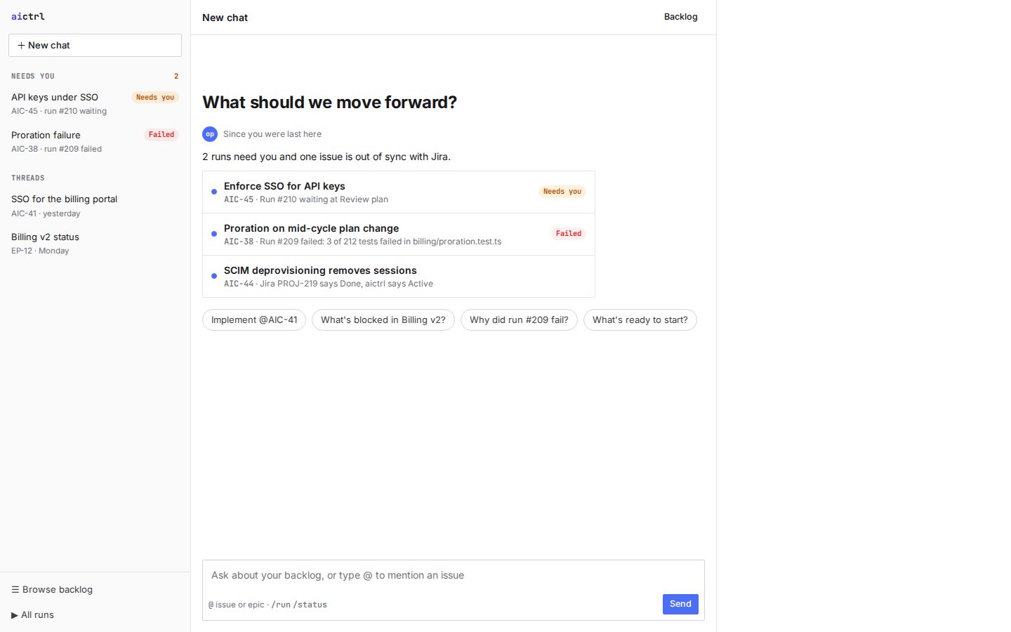
  1. Version 2: a chat home. The heading asks “What should we move forward?” above three runs and issues that need attention and four suggested prompts. The left sidebar lists Needs you items and chat threads; there is no app menu.

    v2 Chat first

    What changed
    The home page became a conversation: “What should we move forward?”, with threads, suggestions and issues mentioned with @.
    Why
    The first draft, a fixed three-pane planner, felt rigid.
    What the tests showed
    No agent test yet. Product review: “we lost the context”. The backlog had dropped out of the app’s navigation.

    Landing screen: 10 controls, 98 words (a chat home, not a list).

    1. Home is a chat prompt: “What should we move forward?”
    2. The sidebar lists chats and threads. There is no app menu, so the backlog has left the navigation.
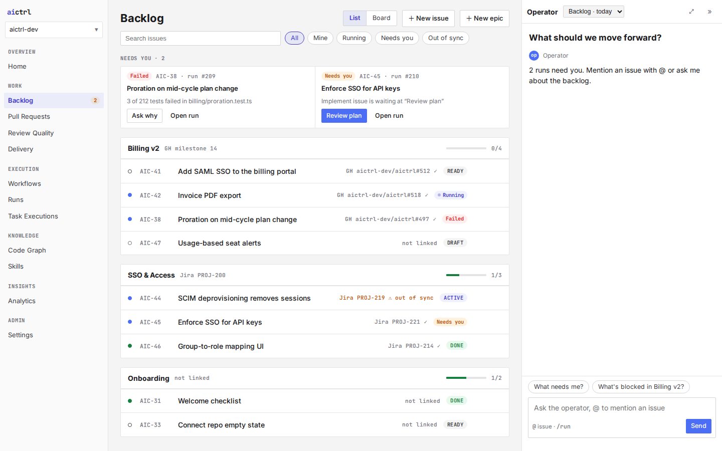
  2. Version 3: the app menu on the left with Backlog selected; a Backlog page with a Needs you strip of two cards above issues grouped by epic; the Operator assistant docked on the right.

    v3 Backlog in the app

    What changed
    A Backlog page in the app menu: issues grouped by epic, List and Board views, a “needs you” strip, and the assistant docked on the right.
    Why
    Keep people where their work already is.
    What the tests showed
    No agent test yet. Product review: judge readiness first and show the top issues. Never show a model name or a score; ready is yes or no.

    Landing screen: 34 controls, 180 words.

    1. Backlog is a page in the app menu
    2. A “needs you” strip above the epics
    3. The assistant is docked on the right
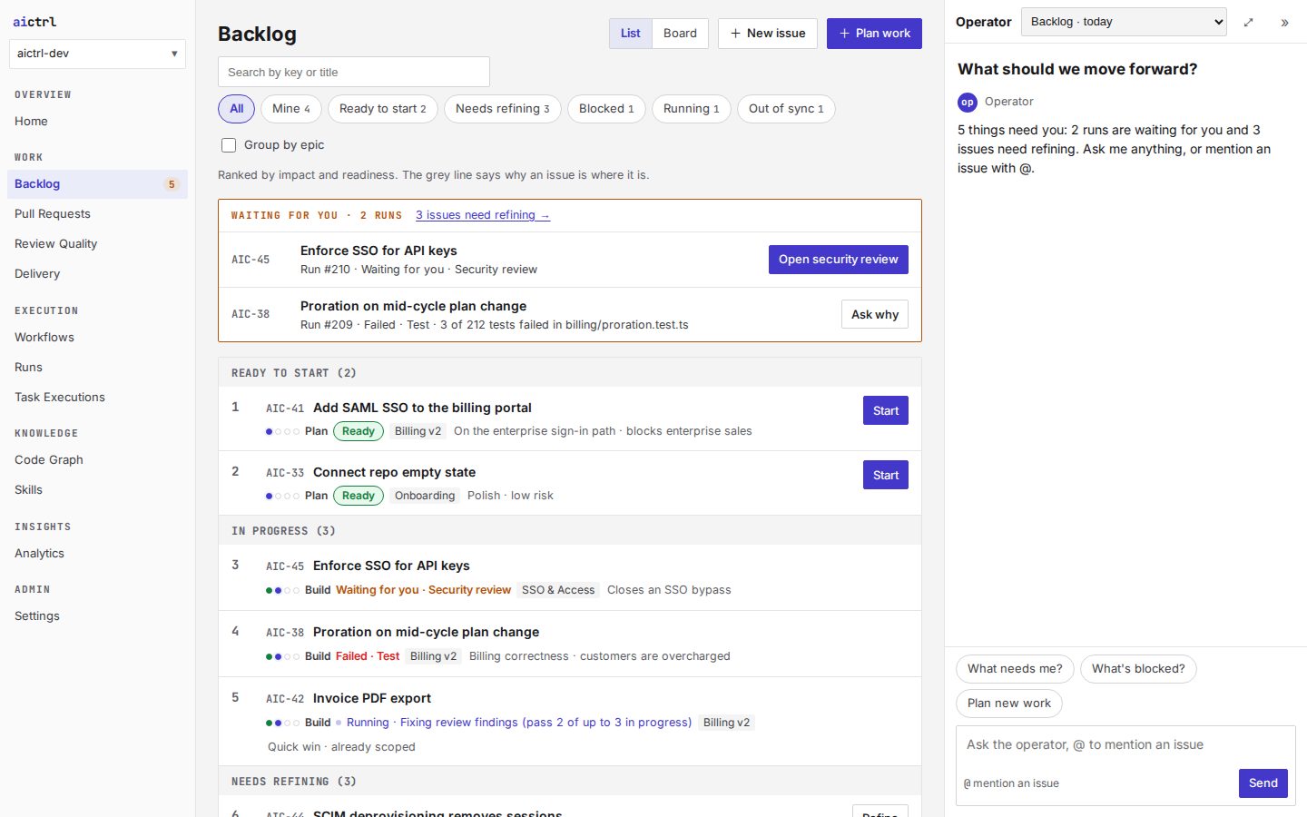
  3. Version 4: a Backlog page with search, filter chips, a Waiting for you box and one ranked list grouped into Ready to start and In progress; every row carries stage dots, a stage, a status, an epic tag and a reason.

    v4 Ranked by readiness

    What changed
    One ranked list: Ready to start, In progress, Needs refining. The readiness verdict is the status, and the Planner folds into the Backlog.
    Why
    The v3 review: judge readiness first.
    What the tests showed
    First test: 83% success, planning 0 of 3. Issues landed in a new epic, and one tester claimed a success that did not happen. After fixes, 100%. But dense: 37 controls, 27 badges and 299 words.

    Landing screen: 37 controls, 299 words.

    1. One ranked list: Ready to start, In progress, Needs refining
    2. Each row stacks stage dots, stage, status, epic and a reason
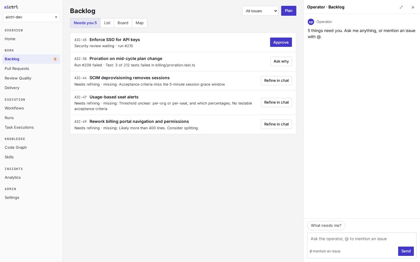
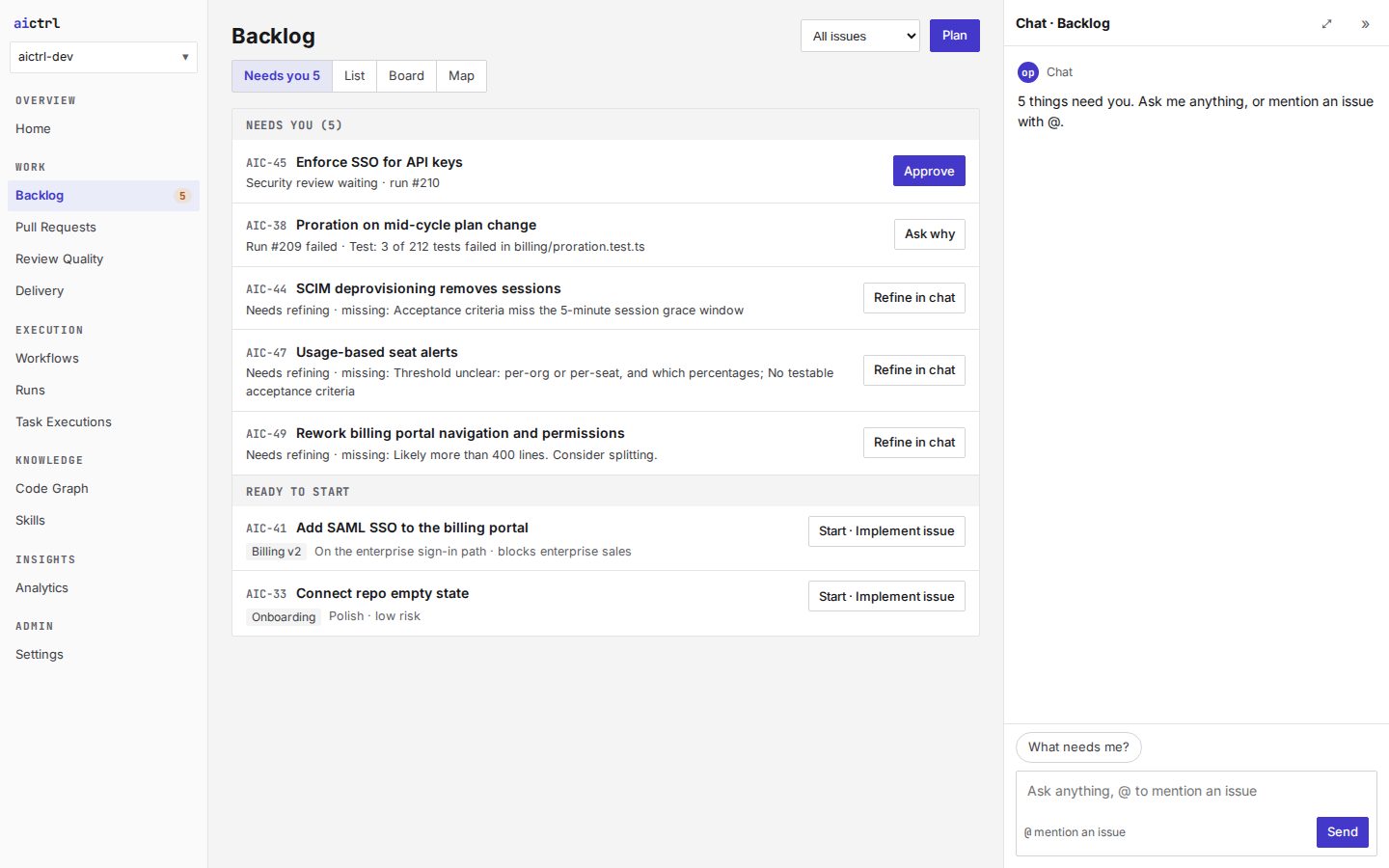
  4. Version 5: a short Needs you list whose first row, Enforce SSO for API keys, has the only solid button, Approve. Nothing on the screen is ready to start.

    v5 Four rules

    What changed
    One word per status, one verb (“Start”), one place per job, one attention list (“Needs you”). 16 controls, 0 badges, 114 words.
    Why
    Product review: simplify, and keep names and places consistent across screens.
    What the tests showed
    88% success, but 2 of 2 novice testers approved a security review instead of starting work. Needs you opened on approvals and hid the ready work.

    Landing screen: 16 controls, 114 words.

    1. One attention list, Needs you, is where the screen opens
    2. The first solid button is Approve, for a security review
    3. The list ends here: no work is ready to start
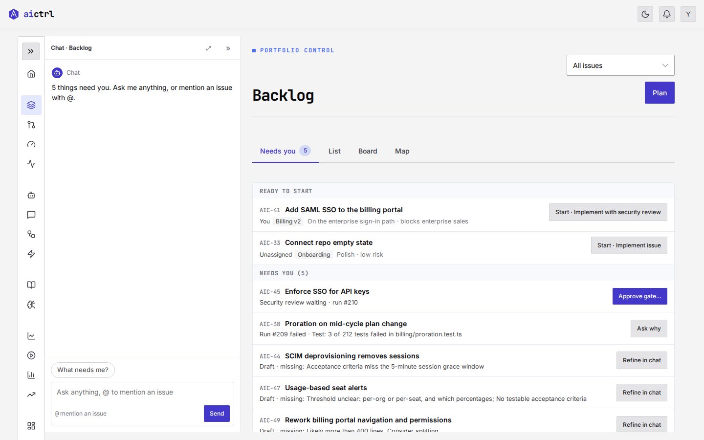
  5. Version 5.1: the Needs you list with a Ready to start group added at the bottom; each ready row has a button reading Start · Implement issue. The side panel is titled Chat.

    v5.1 Ready work returns

    What changed
    Ready to start moves inside Needs you. Buttons say what they launch (“Start · Fix CI”). Blocked issues say what they wait on. Approvals ask to confirm. “Operator” is renamed “Chat”.
    Why
    The misclicks in v5.
    What the tests showed
    3 of 3 novice testers started the right issue; every re-tested task passed.

    Landing screen: 20 controls, 157 words.

    1. Ready to start is back, inside Needs you
    2. Buttons name the workflow they launch
    3. “Operator” is now “Chat”
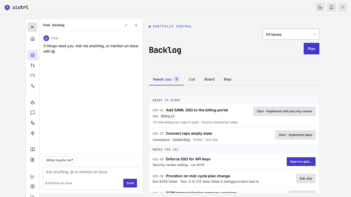
  6. Version 6 in the product’s own styles: a Portfolio control page header, a Ready to start group above the Needs you approvals, and chat docked on the left beside a collapsed icon menu.

    v6 Built from the product

    What changed
    The product’s own CSS and components. Product statuses (Draft, Ready, Blocked, Active, Review, Done), a page per task, chat docked on the left, menu collapsed. Ready to start moves above approvals.
    Why
    Product review: ground the design in what exists so it can ship. The simulator also flagged that on a 1366×768 laptop the first screen showed only approvals.
    What the tests showed
    Full role model (22 tasks, 4 roles): 83% → 96% after seven fixes; J 4.27 → 2.47. Moving Ready to start above approvals, on a laptop: 1 of 3 → 3 of 3 hurried testers started the right issue.

    Landing screen: 28 controls, 214 words.

    1. Ready to start comes first, above approvals
    2. The product’s own page header and components
    3. Chat docked on the left; the menu collapses to icons
  7. Version 6.1: the same layout as version 6 with a tighter header, the All issues filter beside the Plan button, and the list starting higher on the screen.

    v6.1 Polish pass

    What changed
    Tighter spacing between header, tabs and list; the filter sits beside Plan; row details in larger sans type.
    Why
    A polish pass: measure the rendered screen, fix, re-measure.
    What the tests showed
    Same 28 controls and 214 words as v6. Measured and blind-compared; that story gets its own article.

    Landing screen: 28 controls, 214 words.

    1. Filter and Plan share one row, so the list moves up
    2. Less space between header, tabs and list
    3. Row details in larger sans type
Figure 1: Seven versions of the Backlog landing screen, v2 to v6.1. 1440×900, default scenario, mock controls hidden; numbered markers point at what changed. Controls and words are counted inside main, the same way as in Figure 2. Watch where ready work sits: v5 drops it, v5.1 brings it back under approvals, v6 moves it to the top. Click data is available for v5, v5.1 and v6: where agent testers clicked, and where Jev’s simulated user predicted a first click, each on the screen that experiment used (1440×900 for v5 and v5.1; 1366×768 before and after moving Ready to start above approvals, for v6).
Figure 2: Controls and words on the landing screen, per version. Visible controls and words inside main, measured the same way each time: 1440×900 viewport, default scenario. Controls use the left axis, words the right. Source: aictrl internal measurement, 24–26 Sep 2026.

Density fell hard at v5. Then it climbed back as each fix added something a tester had needed. That climb is the subject of the limits section.
Four moments where the evidence changed the design

1. We simplified the screen, and novice testers approved the wrong thing

v5 applied four rules: one word per status, one verb, one place per job and one attention list. The attention list was Needs you. It opened on approvals and hid the work that was ready to start. Both Haiku novices approved a security review. Neither started the issue they were asked to start.

v5.1 put ready work back inside Needs you. Buttons now say what they launch. Blocked issues say what they wait on. Approvals ask for confirmation. All 3 novice testers started the right issue.

A cleaner screen is not a safer one. The first thing on screen is what a hurried first-time user would act on.

Version 5: the Needs you list starts with Enforce SSO for API keys and a solid Approve button. There is nothing to start.
Before: the simplified screen. The only solid button is Approve. There is no ready work to start.
Version 5.1: the same list with a Ready to start group added below, each row with a Start, Implement issue button.
After the fix. Ready to start is back, and each button names the workflow it launches.
Figure 3: Ready work comes back, and buttons name what they launch. Same scenario, 1440×900.

2. On a laptop, the first screen showed only approvals, and the simulator saw it first

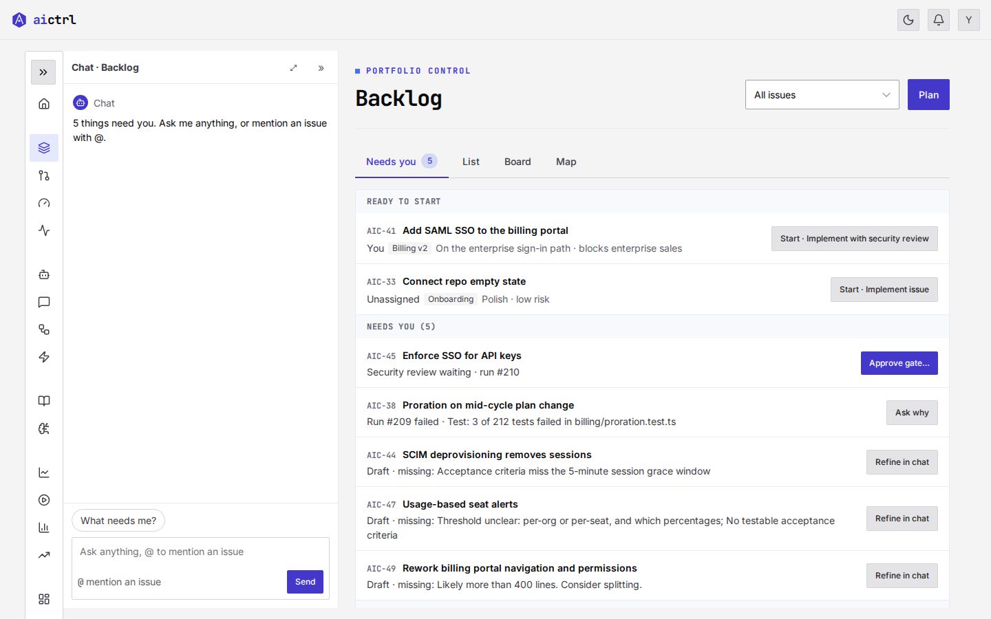
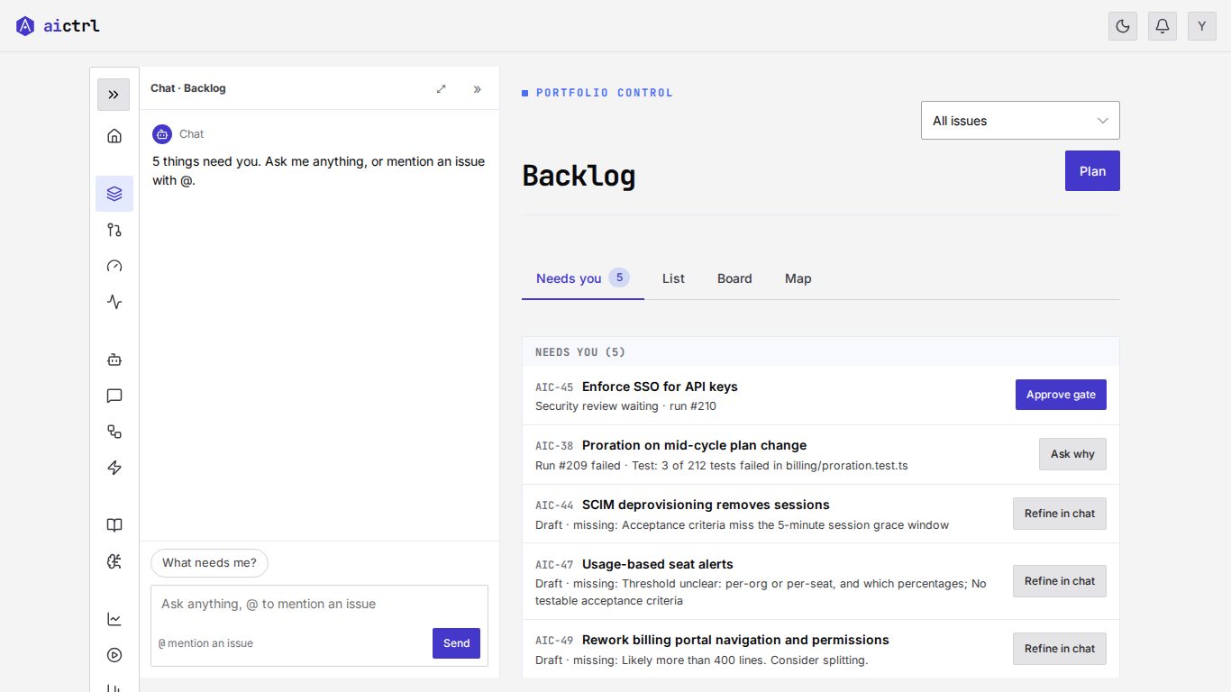
On a 1366×768 laptop, the first screen of v6 showed only approvals. The simulator flagged this before any agent run did.

We tested one change: move Ready to start above approvals. Over 24 walks per arm, success rose from 0.04 to 0.96 and harm fell from 0.67 to 0. The 90% confidence interval of the difference was +0.83 to +1.00.

Then we checked it with hurried agent testers on a laptop viewport. Before the change, 1 of 3 started the right issue. After it, 3 of 3 did. Wrong approvals fell from 2 to 0.

Before moving Ready to start above approvals, at 1366 by 768: below the Backlog header the first screen shows only the Needs you group, starting with an Approve gate button.
Before. Above the fold: approvals and items to refine. Nothing to start.
After moving Ready to start above approvals, at 1366 by 768: a Ready to start group with two Start buttons sits above the Needs you group.
After: Ready to start moved above approvals. Both issues you can start are visible without scrolling.
Figure 4: The same screen on a laptop, before and after moving Ready to start above approvals. 1366×768, default scenario.

3. A confirm beat removing the button

A tester triaging the backlog approved a gate nobody had asked for. We had two ideas.

Agent testers agreed with Idea B. Unasked approvals fell from 1 of 7 to 0 of 5. The one mistaken click was cancelled at the confirm.

The null result for Idea A mattered as much as the win for Idea B. It kept a change with no measured gain out of the design.

Figure 5: Two layout bets, predicted by the simulator and confirmed by agent testers. Success is the share of walks or tester runs that completed the task (higher is better). Harm and unasked approvals are the share that approved something nobody asked for (lower is better). Simulator: 24 walks per arm for moving Ready to start above approvals. Agents: hurried testers on a laptop viewport for the same change. Source: aictrl internal measurement, 24–26 Sep 2026.

4. Placeholder controls fail tasks

v6 was the first version built from the real product CSS and components. We ran the full role model against it. Success was 83%. After seven fixes it was 96%, and J fell from 4.27 to 2.47.

Several failures traced back to a stub or an icon-only control. The table shows six of the fixes and what they did. The seventh lets chat answer “who is working on X”.

TaskBeforeAfterWhat changed
R3 Send a review back0/44/4A real Request-changes form replaced a stub
L7 Stop a run0/13/4Cancel run, with a confirm
P2 Split an issue1/44/4The proposal carries notes, and accepting it commits the split
L6 Pick a workflow2/44/4A visible radio list
P6 Change a status2/33/3A labelled menu instead of a "⋯" icon
L8 Who is working on what2/32/3An In progress group with owners; vision testers still miss it below the fold

Seven UI fixes raised task success for every role.

A simulated user built on Jev screened layout changes in minutes before agents confirmed them.before → after

Engineering lead
What changedCancel run with confirmWorkflow as a radio listWho is working on what
Product owner
Split proposal with notesLabelled status menu
Reviewer
Request changes as a real form
All roles
70%80%90%100%Share of agent-tester runs passed
Figure 6: Task success by role, before and after seven UI fixes. Success is read from page state after each agent-tester run on the role's tasks. Percentages are rounded; fractions are runs passed; arrows show the gain in percentage points. The amber tag is the task the fixes did not solve (still 2 of 3 runs; testers miss it below the fold). 72 runs per round; per-role run counts differ by round (Lead 32 → 35, Reviewer 16 → 13). Axis starts at 70%. Source: aictrl.dev experiment with AI agent testers (not people), 24–26 Sep 2026.

Where the simulator is right, and where it isn't

We checked the simulator against 72 agent sessions.

What it reproduced

What it missed, or flagged wrongly

What had no effect

Distracting, irrelevant text in the prompt changed nothing. The fold is what hides things, not a cut to the top few controls.

The rule we use

The simulator ranks variants and finds first-glance risks in minutes. Anything it finds, we confirm with agent testers before we accept it.

What the field has found

Our runs cover one product area over three days. Larger studies point the same way.

Simulated users are too cooperative

In one study, 49.0% of a GPT-4o simulated user's turns were polite, against 15.3% for humans (Zhou et al., 2026). The authors call simulators “excessively cooperative, stylistically uniform, and lack realistic frustration or ambiguity.” In another, agent success rates moved by up to 9 percentage points depending on which LLM played the user (Seshadri et al., 2026).

First-click predictions are shaky

Kuric and colleagues compared GPT's predictions with 12 first-click tests and 3,431 real participants (Kuric et al., 2026). The predictions differed significantly in 53% of tasks. Personas and chain-of-thought “fail to create sensible fidelity improvements apart from inflating believability.”

Our Jev simulator makes the same kind of prediction. Against 72 agent sessions it caught the misclick and the fold problems, but missed multi-turn chat and interpretive answers. So we use it only to rank layout bets, then confirm with agent testers and, finally, people.

Agent testers find real problems, but not all of them

In UXCascade, UX professionals working from simulated agents found about as many issues as those working from a report written by people: 2.875 against 2.625 each, not a significant difference (Holter et al., 2026). The human report was stronger on discovery and interaction issues: 5 of 7 against the agents' 2 of 7. WebProber found 29 usability issues across 120 academic personal websites, many missed by traditional tools (Ye et al., 2025). At Userbrain, 5 of 5 synthetic users completed a task that 3 of 5 real users completed (Rössler, 2026). The simulation overestimated success.

Where UX researchers land

Nielsen Norman Group sees synthetic users as preparation for research with people, not a replacement: “A synthetic user can be useful if researchers treat the output as a hypothesis to guide future research.” (Rosala and Moran, 2024). Raluca Budiu found that “the standard deviation in the synthetic data was consistently lower than the standard deviation in the human data.” (Budiu, 2025). Less spread means fewer edge cases. A MeasuringU review of experiments with synthetic users counted 9 encouraging findings and 14 discouraging ones (Lewis and Sauro, 2026). UX researchers rated UXAgent's simulated sessions 3.4 out of 5 for helpfulness and 3 for realism (Lu et al., 2025).

Four ways to check a screen
MethodGood atMissesEvidence
One-shot AI audit (judges a screenshot)Speed; it needs no tasks or harnessMost real problems; most of what it flags is wrongBaymard (2023); Gao et al. (2026)
Simulated user predicting first clicks (our Jev simulator)Ranking layout bets in minutes; first-glance and fold risksMulti-turn chat and interpretive answers; real click patterns; it is too cooperativeKuric et al. (2026); Zhou et al. (2026); this post
Agent testers doing tasks, success read from page stateBroken flows, stubs and unlabelled controlsDiscovery issues; colour; they succeed where people may notHolter et al. (2026); Ye et al. (2025); Rössler (2026); this post
PeopleThe final answer: real spread, frustration and edge casesRounds are slower and cost more, so they run less oftenRosala and Moran (2024); Budiu (2025); Lewis and Sauro (2026)

Honest limits, and the detail that came back

Agents are not people

Agent testers are patient. They read text rather than layout. They never see colour. We treat their results as a check on clarity and flow. Real users give the final answer.

Our testers read the accessibility tree, which catches unnamed or mislabelled controls. That is no substitute for testing with people who use screen readers.

The case against synthetic testers

Erika Hall argues that talking to real people is not optional: “It is unethical, indefensible, and also unnecessary, to create a product or service or policy that affects other people, without having conversations with representatives of those populations.” (Erika Hall, LinkedIn)

Vitaly Friedman puts it as a trade: “I would always choose one day with a real customer instead of one hour with 1,000 synthetic users pretending to be humans.” (Friedman, 2025)

We agree on the final answer. Our agents check flows between rounds with people, not instead of them.

Detail crept back

Since v5, controls went from 16 to 28 (+75%) and words from 114 to 214 (+88%). Each addition had a measured reason. The screen is still below v4's 37 controls and 299 words. The open question is whether 214 words is right. The next test is the real page, with people.

Known open issues

What it costs

A 6-task baseline is 18 tester runs, mostly Haiku. A 20-task round is about 70. The simulator screens a hypothesis in minutes.


What we would do again

  1. Write tasks with state checks before you design, not after. A success check and a must-not check per task. Read results from the page, not from the tester.
  2. Simplify, then test with a hurried novice on a laptop screen. That is where our cleanest version failed its testers.
  3. Use simulators to rank ideas, agents to check flows, and people for the final answer. The studies in Part 5 back this, not just our runs. Each step is slower and closer to the truth than the one before.

What would you test first on your own product?


Frequently asked questions

Can AI agents replace usability testing with people?

No. Agent testers check clarity and flow between rounds with people, not instead of them: they are patient, read text rather than layout and never see colour. Nielsen Norman Group treats synthetic users as preparation for research with people, not a replacement, and a MeasuringU review of experiments with synthetic users counted 9 encouraging findings against 14 discouraging ones. People give the final answer.

How do you know an AI tester really succeeded?

Read success from the page state, never from the tester’s own report. Each of our 22 tasks has a success check and a must-not check, and the must-not check catches harm such as an approval nobody asked for. In one round, a tester reported success after creating nothing; only the page state showed the failure.

How accurate are simulated users?

Accurate enough to rank layout bets, not to give the final answer. Checked against 72 agent sessions, our simulated user built on Jev caught the misclick and the fold problems but missed multi-turn chat and interpretive answers. Outside studies agree: in 12 first-click tests with 3,431 real participants, GPT’s predictions differed significantly in 53% of tasks (Kuric et al., 2026), and 49.0% of a GPT-4o simulated user’s turns were polite, against 15.3% for humans (Zhou et al., 2026).

What does an agent-tester round cost?

A 6-task baseline is 18 agent-tester runs, mostly on Haiku, and a 20-task round is about 70. An agent round takes about an hour. The simulated user is the cheaper first look: it screens a hypothesis in minutes, at about 100–200 Jev calls per task.

How can I run this on my own product?

Use the open-source ux-testing skill in our public skills repo on GitHub. It runs agent testers against your pages through a Playwright harness that exposes only the accessibility tree, and reads success from page state. Write tasks with a success check and a must-not check before you design, then confirm what the agents find with people.


Try it on your own product

The ux-testing skill in our public skills repo runs agent testers against your UI through a Playwright harness, reads success from page state and turns the results into a before-and-after report. Agent testing needs no API key. The optional simulated user needs a fast model API such as TypeSafe’s Jev (set TYPESAFE_API_KEY).

How aictrl.dev helps

Disclosure: aictrl builds workflow orchestration and skills for agent work, so we have a commercial interest in the practices described here. The ux-testing skill used in this post is published in our public skills repo at skills/ux-testing. Jev is TypeSafe's System One model (typesafe.ai), used under our own API key. To run design loops like this one as workflows, see how aictrl.dev can help.

Sources and method

Published September 26, 2026 · Analysis by Bulat at aictrl.dev, co-authored with AI

Related Articles